I used the New York Times API to see how it has covered the Coronavirus since the crisis began.
My feeling was that for about a month, from mid-March to mid-April, it was all anyone could talk or think about. And since then, it still dominates the public consciousness but people are, understandably, tired of hearing about it. It takes a lot of mental energy to stay concerned about something for a long period of time.
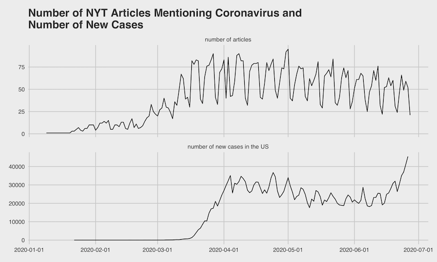
This mostly plays out in the data. Coverage has slowly ebbed since the beginning of May. This is only tracking articles that mention the virus, so it’s a very loose definition; I would expect articles that are truly about coronavirus to have dropped much more.
The second chart, the number of new cases in the US (also from the Times) is obviously worrisome. I expect that the recent rise in new cases is in part due to people having grown tired of worrying about coronavirus and relaxing the protective measures they were taking.
I’m not saying the Times is to blame for this (it would be great if local TV news channels offered well-maintained APIs so that I could analyze their content!), or even that they should necessarily be covering the virus any differently. But I think it is a good reflection of the United States’ collective attention span, and how even when a problem is obvious and dire, it is difficult to get people to focus on something for a long time.
Using the NYT API to get data yourself
I wrote a Python script to access the API, and you can find the notebook here. I tried to comment and make it easy to follow, but feel free to reach out if you have any questions, to joe @ this website.
Thanks for reading. If you like this kind of analysis, sign up below and I’ll notify you when I write something new.